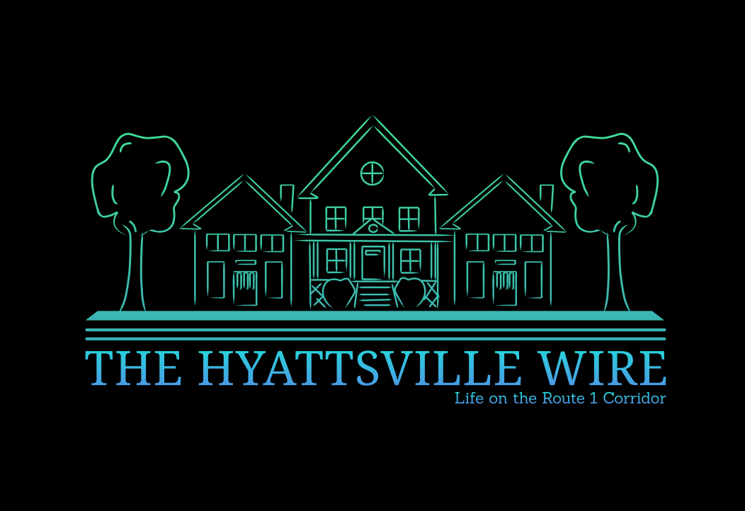
You may have noticed some new things about the Hyattsville Wire.
That’s because we recently launched our biggest redesign since we started in 2012, introducing a new logo, masthead and greatly improving the desktop and mobile experience with lots of upgrades. It’s the same three-column format you’ve grown to love, just bigger and better with the latest bells and whistles.
In our redesign, we decided to keep our original neighborhood masthead design that reflects the architecture of the historic neighborhoods along the Route 1 corridor from Craftsman bungalows to Victorian houses.
But in keeping with that original design, we changed the entire color scheme, bringing you a whole new look for the Hyattsville Wire that’s still familiar. With the redesign, we tried to tap into the arts culture on the corridor and the neon trend. We hope you like it.
We have a more readable mobile version and an even more robust events calendar that is now picked up by Google News, giving your submissions even more visibility. We also made the calendar easier to browse and submit events.
We’re also going to have fun with the new masthead, adding seasonal and holiday touches and changing the accent color to keep it new and fresh, so be on the lookout.
As with any redesign, we are still working on the kinks to get everything up and running perfectly, so bare with us for another week or so as we resolve the little imperfections.
If you have any suggestions on how to make our site even better, please let us know in the comments or email us at news@hyattsvillewire.com.





Very Nice! Eye catching. Your publication is terrific I look for it every day.
I noticed the new look, and I love it!